
What is the Project?
Regression Analysis is one of the fundamental techniques used in Supervised Learning and is essential in statistical modelling. It provides a reliable way of identifying the relationship between a dependent variable (outcome) and one or more independent variables (predictors).
Within this project, we focus on analysing city-cycle fuel consumption in miles per gallon (MPG). The data is stored within a CSV file called car_data, containing 406 data points and 9 variables. The variable list is as follows: MPG, cylinders, displacement, horsepower, weight, acceleration, modelYear, origin, and carName.
Using the MATLAB programming language, the implementation provides a statistical analysis of the data without the help of built-in functions. The program has been divided into four files, each covering a single component: data pre-processing, statistical analysis, regression analysis, and the visualisation of the results.
Data Pre-Processing
The first step of the project involved reviewing the data and handling any missing entries. The process starts by iterating over each row of data, storing it into a table called car_data, and then assigned its respective data type (double or string). With the data successfully imported into MATLAB, we can now begin handling the missing entries. There are a total of 14 missing values, 8 for MPG and 6 for horsepower.
Handling missing data isn't always easy. Swalin (2018) explains that there are three common reasons for missing data entries:
- Missing at random (MAR) - there is a slight relation to the observed data.
- Missing completely at random (MCAR) - there is no relation to any of the data.
- Missing not at random (MNAR) - the missing values depend on hypothetical values (e.g. not revealing your income) or other variable values.
When handling MAR and MCAR data, values can be freely deleted or imputed. However, when working with MNAR data, removing the observations can lead to bias in the model. The 14 entries that are missing fall into the first two categories, allowing for modification. Due to the small size of the dataset, I implemented the imputation method using the respective columns mean value. With only 406 data points, there is a limit to the amount of training data available and losing 14 entries could negatively impact the model's results.
Analysis
The analysis focuses on four independent variables: mpg, horsepower, weight, and acceleration, and covers five critical statistics: mean, median, minimum value, maximum value, and the standard deviation (std).
The results for each variable are stored within a table called statistics, found in figure 3.1, providing an insight into the scope of the data. When comparing the variables, it is clear that weight has the widest spread of data.
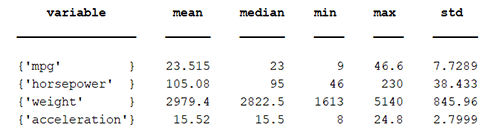
Figure 3.1. Statistics table.
Taking this one step further, we can visualise the data using box plots (figure 3.2). Box plots provide a clear indication of the distribution and skewness of the data. It provides a visual representation of outliers in the data (circles), the maximum and minimum values (top and bottom lines, respectively), the medium (red line), the upper (Q3) and lower (Q1) quartiles, represented by the top and bottom of the box, respectively, and lastly the interquartile range (IQR) reflected by the height of the box.
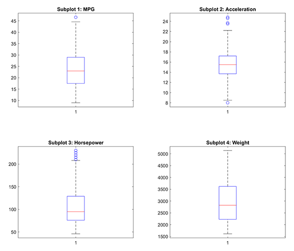
Figure 3.2. Box plots of each variable.
Using the box plots, we can immediately identify that horsepower and acceleration have a lot of outliers. Also, three of the four variables (MPG, weight, and horsepower) have a greater spread of higher values when compared to their medians.
These statistics are not the only method for gaining an understanding of our data. We can also use a correlation matrix (figure 3.3) to identify the relationship between variables. Figure 3.3 provides the results of the Pearson correlation coefficient, which measures the linear association between variables, where the value range is between -1 to +1. The metric provides three extremes: -1, 0, and +1.
-1provides a perfect negative linear correlation0states there is no linear correlation, and,+1is a perfect positive linear correlation
A positive correlation signifies that the variables are moving in the same direction. Similarly, a negative correlation states that the variables are moving in the opposite direction.
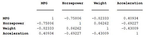
Figure 3.3. Correlation matrix.
Reviewing the correlation table, it is clear that acceleration isn't as highly correlated (positive or negatively) as the other three variables. Weight has the highest negative correlation with MPG and the highest positive correlation with horsepower. However, MPG also has a high negative correlation with horsepower and has a medium positive correlation with acceleration. Some of the correlations are visualised in the regression graphs in figures 3.4.
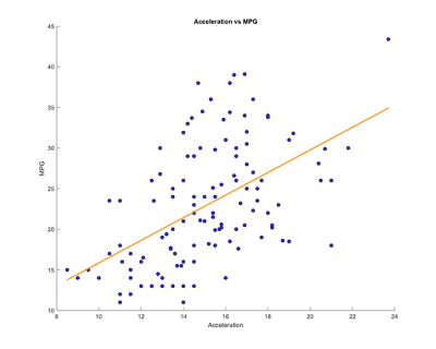
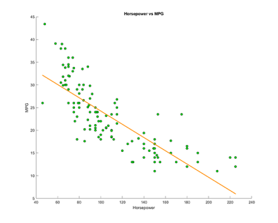
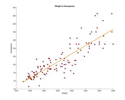
Figure 3.4. Linear regressions that show comparsions between select variables.
Overall, the regression graphs show the relationship between select variables from the correlation matrix. In the first graph, we compare the acceleration against the MPG, which shows that the data is widely spread apart with a slight positive correlation around the central points. In the second and third graphs, comparing horsepower vs MPG and then against weight, there is a clear negative and positive correlation between the two.
References
Swalin, A. (2018) How to Handle Missing Data. Towards Data Science. Available from https://towardsdatascience.com/how-to-handle-missing-data-8646b18db0d4.